


RECYLOPATH
Sort Smart, Live Green: Scan, Learn, and Protect with Every Tap!
By: Aimee McConnell
This is an app ideation design
Problem Statement
Many people and specifically homeowners face confusion and uncertainty when it comes sorting waste, leading to increased contamination rates and environmental harm. Existing solutions lack accessibility and real-time assistance. To address this challenge, there is a need for a mobile app that empowers users to make informed waste sorting decisions.
Solution / Hypothesis
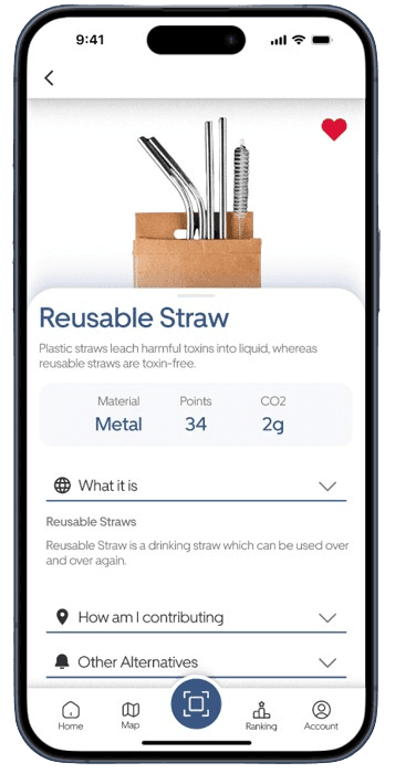
By integrating convenient product scanning features into a mobile app and complementing them with educational resources, environmental tips, and promotion of green initiatives, we hypothesize that users will be more motivated and engaged in their waste sorting efforts. We anticipate that the combination of real-time assistance and informative content will enhance user awareness and understanding of proper waste disposal methods, ultimately fostering wider participation in environmental protection efforts and contributing to a reduction in contamination rates.
Value Proposition
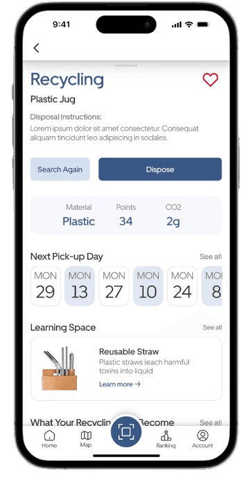
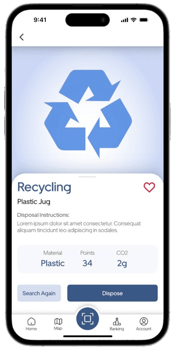
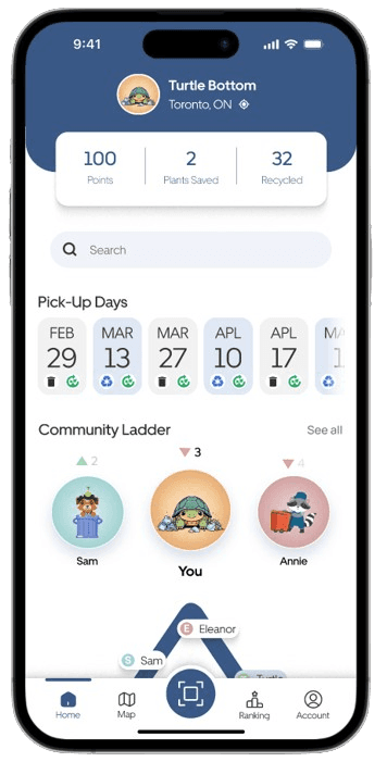
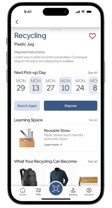
Recylopath is dedicated to addressing the confusion surrounding waste sorting, offers a comprehensive solution to empower users in their environmental efforts by keeping it simple and foster a green community. With our intuitive augmented reality feature, users can effortlessly determine proper disposal methods for various items, eliminating the guesswork.
What I did
User research, ideation, wireframing, design, prototyping, user testing and presentation. Assisted in all aspects as we collaborated on all to get input / provide ideas. Mainly worked on the onboarding, splash screen, login pages, tutorial and map feature.
Tools
Miro, Figma, Google Documents, Google Sheets and Google Presentation
Collaboration
I worked with 2 other class mates from my UX/UI Bootcamp at the University of Toronto.

Background and Research
Research
7
Interviews
4
Competitive Analysis
2
App Reference
Key Take Aways
Key takeaways from our problem statement reveal that homeowners struggle with waste sorting, leading to environmental contamination due to a lack of accessible, real-time assistance. Our mobile app, Recylopath, empowers users to make informed waste disposal decisions by integrating a product scanning feature with educational resources and environmental tips, alongside promoting green initiatives. This approach aims to enhance user engagement in proper waste sorting, improve understanding and participation in environmental protection, and ultimately reduce contamination rates. Recylopath's augmented reality feature simplifies waste management by helping users effortlessly identify the correct disposal methods, eliminating uncertainty and fostering a committed green community.
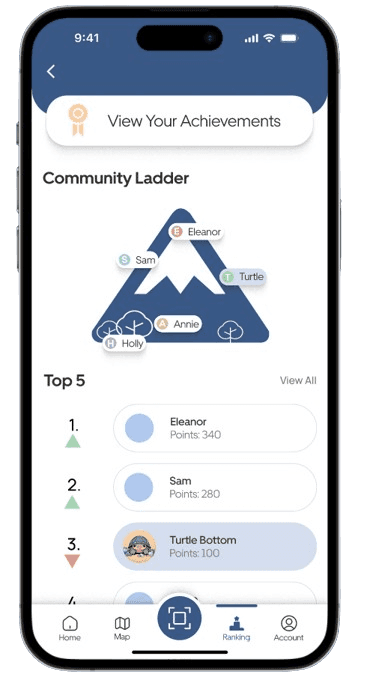
In my competitor analysis, I observed that apps like TO Waste lack a scan feature to assist in waste sorting. Additionally, they do not provide incentives to maintain user engagement nor include educational features to enhance learning about proper waste disposal.
Persona & Journey Map

Elena
Elena, a 34-year-old mechanical engineer, aims to reduce her carbon footprint and set an example in her tech company by improving waste management. She faces challenges like recycling misinformation and complex regional regulations. Elena needs a straightforward app that offers reliable, government-approved recycling information for easy and accessible waste disposal.
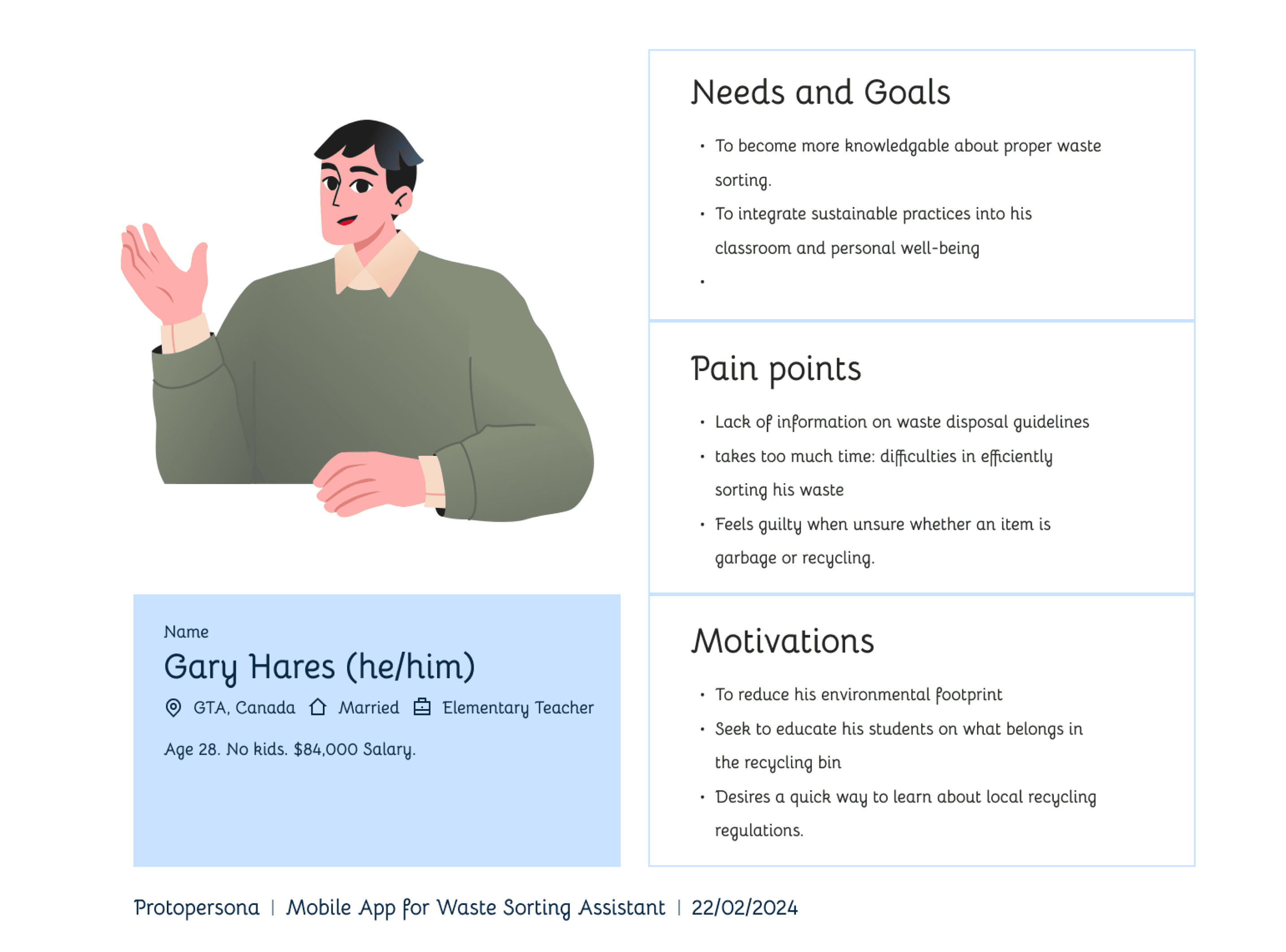
Gary
Gary, a 28-year-old male elementary school teacher, aims to deepen his knowledge of proper waste sorting and integrate sustainable practices into both his classroom and personal life. His challenges include a lack of clear information on waste disposal guidelines and the time-consuming nature of efficiently sorting waste, which often leaves him feeling guilty when uncertain about disposal categories. Motivated to reduce his environmental footprint, Gary seeks to educate his students about recycling and desires a quick, accessible method to learn about local recycling regulations.


Personas
Based on the data collected during the research I set up two personas. I referred to them throughout the entire product development process.
I included content relating to personality, problems or challenges one may face and goals / needs one may search for in a product like this.
Note: Only two personas were developed during this process and I would have liked to develop a couple more to showcase diversity of other potential users.
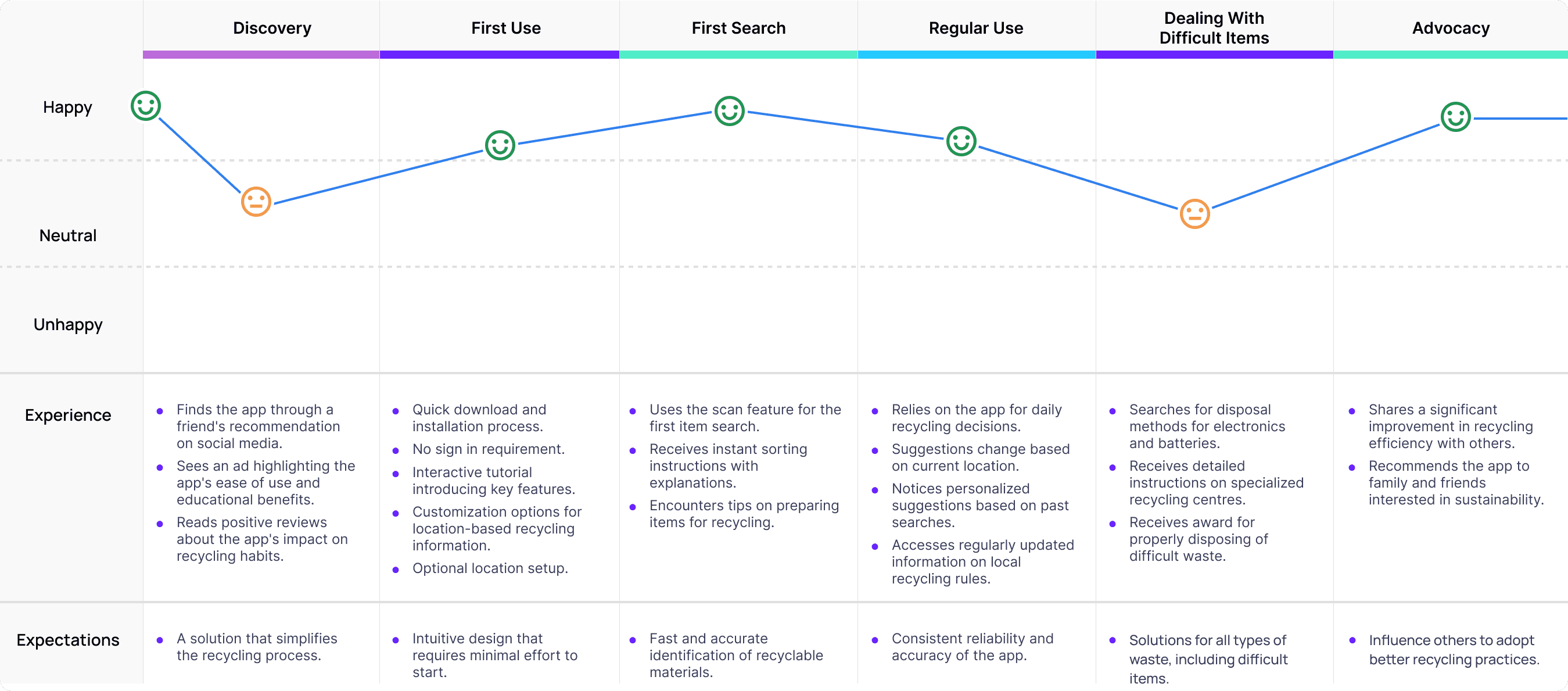
Journey Map
From the crafted persona, I developed a journey map that outlines the potential path a user might take when interacting with the app. This map tracks the user's mood from initial discovery and first-time use, to regular engagement and managing challenging items within the app, culminating in advocacy as they recommend the app to others. It effectively highlights the user's experiences and expectations at each stage.
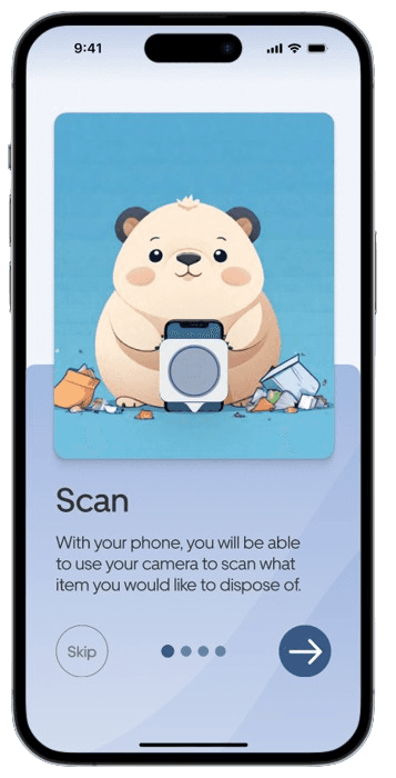
Wire frames and Prototype
Wireframes
I began by creating low-fidelity wireframes to establish the basic layout and features, providing a foundational idea. Subsequently, I iterated to mid-fidelity wireframes, which I shared to gather feedback and refine the design further.

Prototype
After receiving feedback on the mid-fidelity prototypes, I progressed to developing high-fidelity prototypes. These prototypes were shared with users for testing and feedback gathering, enabling me to refine the design through iterative improvements based on their insights.

UI Design

Visual Design
I chose a color palette centered around traditional recycling hues, ultimately selecting blue for its calming properties to ensure users feel at ease while using the app for waste management decisions. The design style was intentionally kept simple, rounded, and straightforward to enhance user experience.

User Testing and Feedback
User Testing
A total of 6 users participated in prototype testing, each assigned 5 tasks. The usability testing revealed minor adjustments required, including visual enhancements and refining the user flow, as outlined in the usability testing plan. Overall there was a positive outcome.
6
User Testers
1
Task was completed 100%
2
Had a success rate of 50%
Take Away
Take the app regionally across Ontario and not just have the peel / Toronto region included.
Then move into provincial and adding guidelines later on.
Next steps would be to develop the app further to add more features.
More user testing could be done to iterate on the app more.
Challenges: This was our third project, and one significant challenge was coordinating meeting times that suited everyone. While we had ample individual work time during the design process, aligning our schedules for UI design reviews and ensuring consistency proved difficult. To overcome this, we frequently exchanged photos, posed many questions, and arranged smaller, more frequent meetings to maintain consistency across the project.
RECYLOPATH
Sort Smart, Live Green: Scan, Learn, and Protect with Every Tap!
By: Aimee McConnell
This is an app ideation design